The design of your website will let your audience know about your products and services. It would let them know what you are upto, what you are planning to do. If the design of your website is good enough, more and more visitors will visit your website and it will in turn attract more and more of traffic to your website. If the design is not good, the customers will move to another website for their services and products. What do you think about the design of your website now? Is it attractive enough to get more and more visitors? Is the design well equipped to get the right kind of customers? So, here we provide you with some of the tips to improve the design of your website.

Navigation :
It has to be simple. You must have experienced this that when you visit a particular website, you get confused what to look for and what not as you do not get the required information that you want. By this, a website loses its customers. So, make sure that your navigation is simple enough for the customers so that they get what they are looking for.

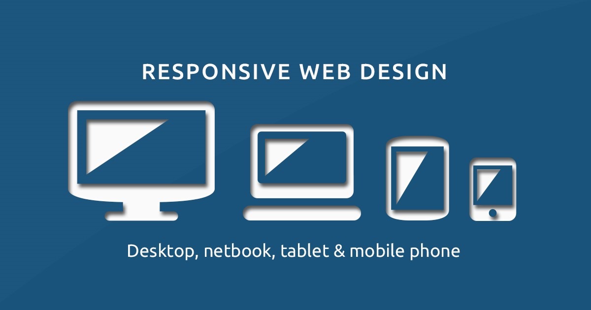
Make sure your website responds well :
It should treat all of them equally, be it a laptop user, or a desktop user or even a mobile phone user. In case a mobile phone user finds it too difficult to visit the website, the person will for sure find another website which offers them a good experience.

Loading of the website should be fast :
We all hate to wait. Nobody likes to wait. So, if your website loads very slowly, you have to be sure that it does not happen as this gives the customers an option to visit some other website which might not work in your favor.

Simplicity is the key :
Do not forget that this is a website and not any sort of project. The colours that you use should be simple enough with simple background and a very decent colour combination. Do not think that the more colourful your website is, the more users it will attract. It is a myth.
Font should be readable :
No matter how good your content is, no matter how great your colour combination is, but if your customer is not able to read it, it is of no use to you. Use a font that is good enough and all your customers are able to read it.
Images will drive more traffic :
Make sure you use as many images as you can. We should not forget that human beings tend to remember images more rather than plain text. So, usage of the images will drive more traffic as they will be remembering more and more.
The button as the end :
The submit button or the send button at the end has to be made very appealing for the users, so that they cannot resist themselves and just click the button. That should be the beauty of the design of the button.

